
Actual Spend Report
The actual spend report is designed to provide you with a comprehensive view of your organization's expenditure on your SaaS applications and services. By understanding and analyzing your actual spend, you can make informed decisions to optimize your IT budget, negotiate better contracts, and identify opportunities for cost savings.
In this documentation, we will guide you through the process of generating, customizing, and interpreting the Actual Spend Report. You will learn how to:
- Customize the report to suit your needs, for example configuring the report period
- Understand the key metrics and insights provided in the report
- Export the report for further analysis or sharing with stakeholders
By leveraging the Actual Spend Report, you can gain valuable insights into your organization's SaaS spending patterns and make data-driven decisions to maximize the return on your IT investments.
Customizing the Report
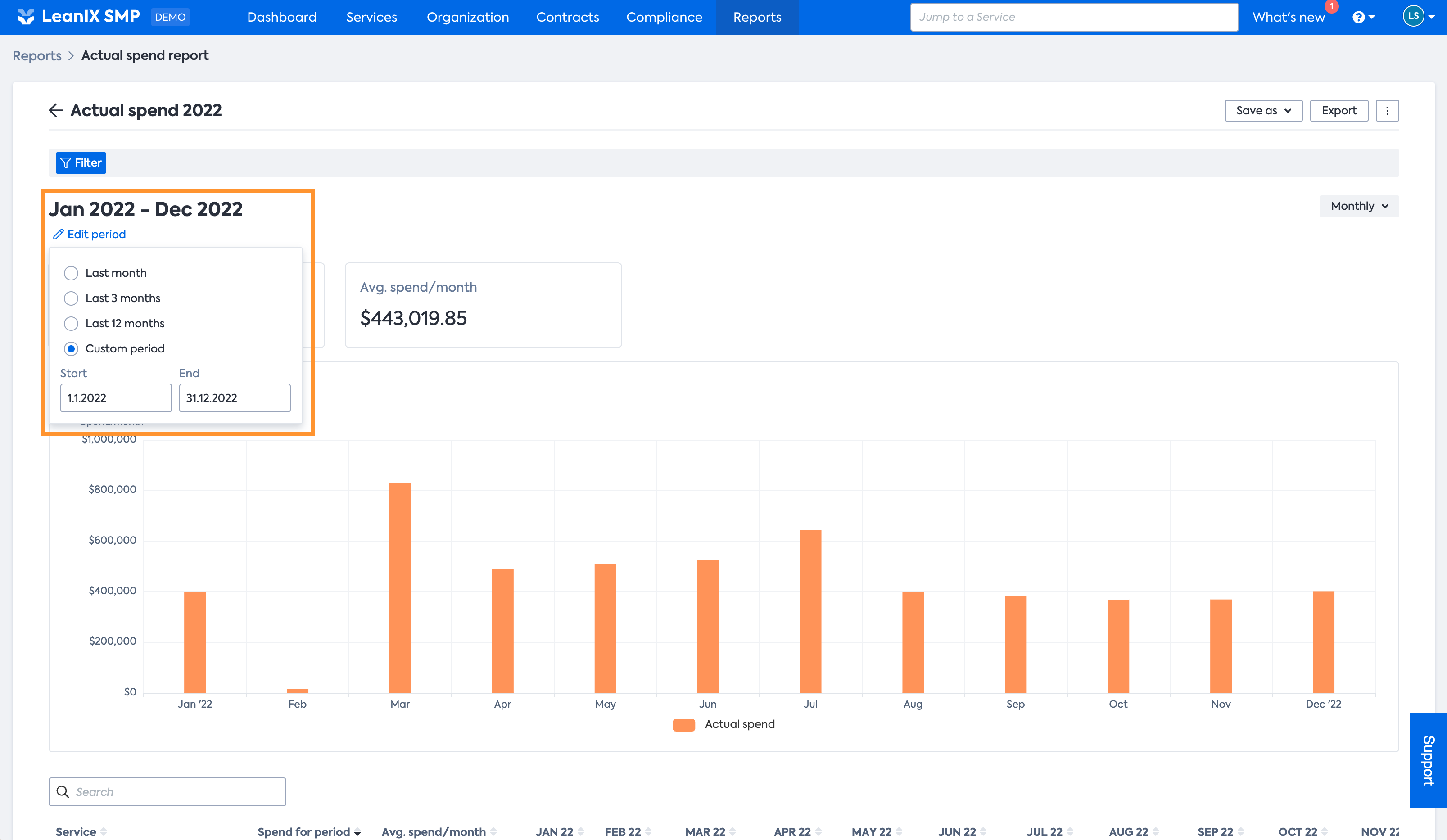
Selecting the Report Period
The Actual Spend Report can be customized by selecting the desired reporting period.
By default, the Report shows the previous 12 months but offers selections for
- Last month - Only shows data for the previous month
- Last 3 months - Shows the data for the 3 previous months
- Last 12 months - Shows the data for the 12 previous months
- Custom period - Allows to select any custom period. The smallest selectable granularity is months, and they always start on the 1st day and end on the last day of a month (therefore only considers full months)
Setting the granularity
The Report allows you to select the reporting granularity, meaning you can select the scale on which the data is aggregated.
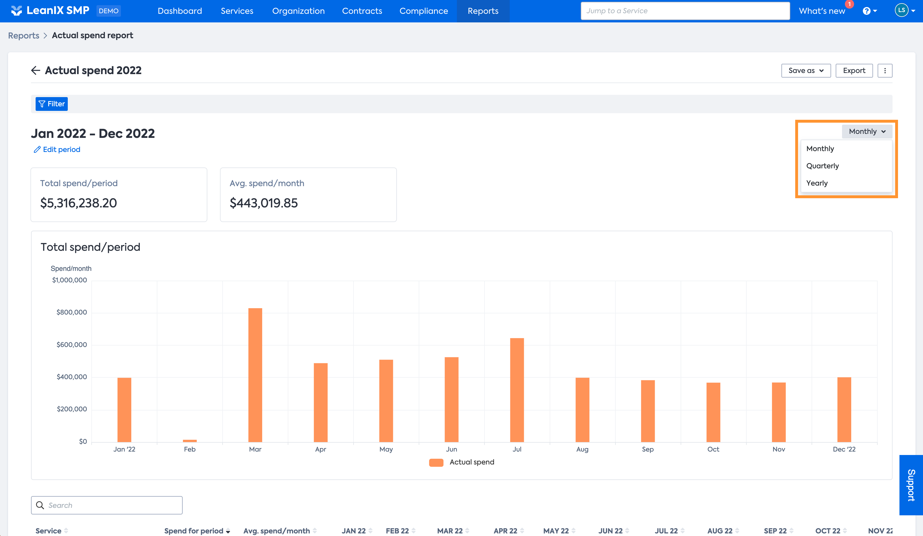
The minimum granularity is months, but data can be aggregated into quarters or even years.
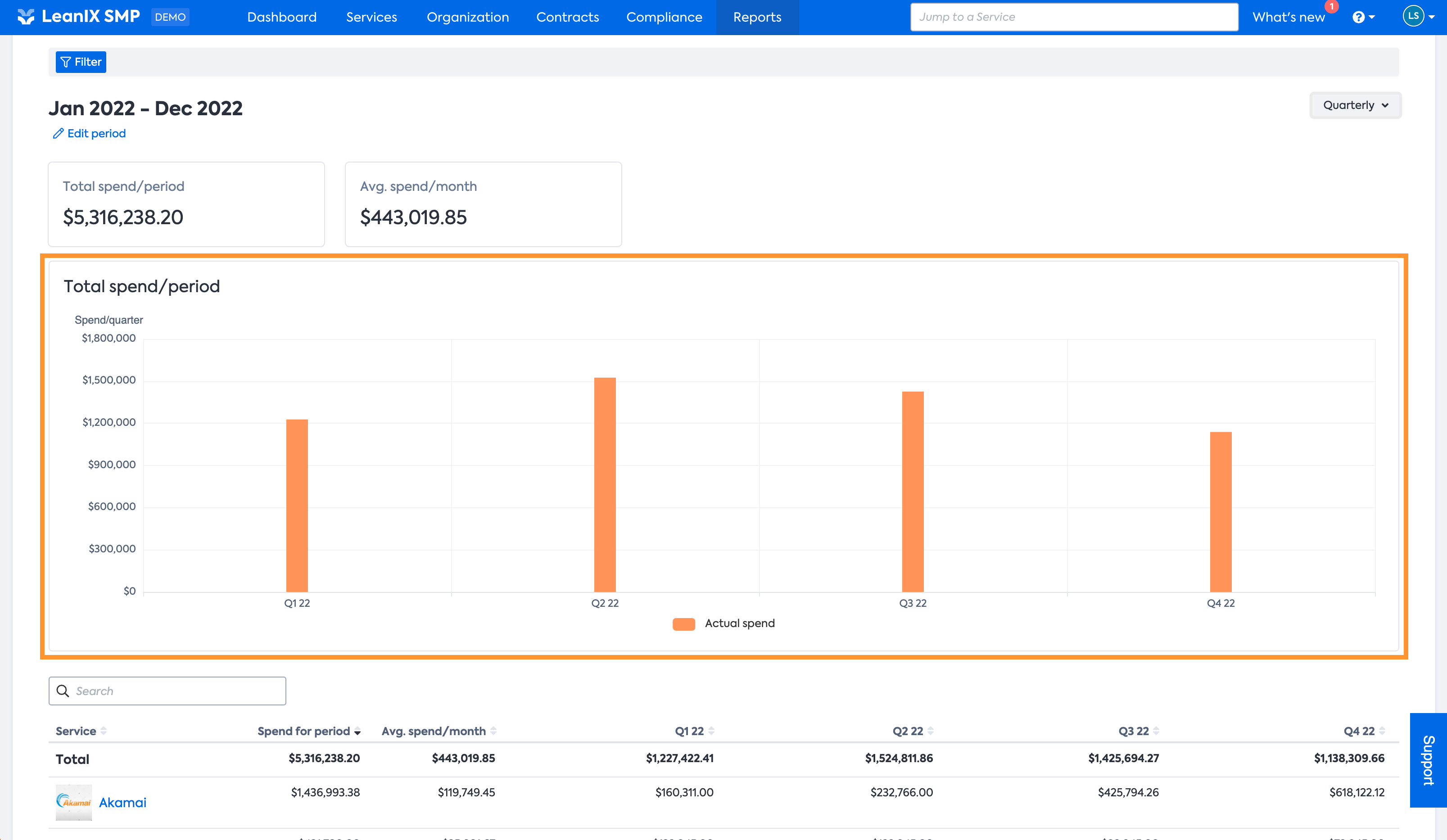
KPIs and insights
KPIs
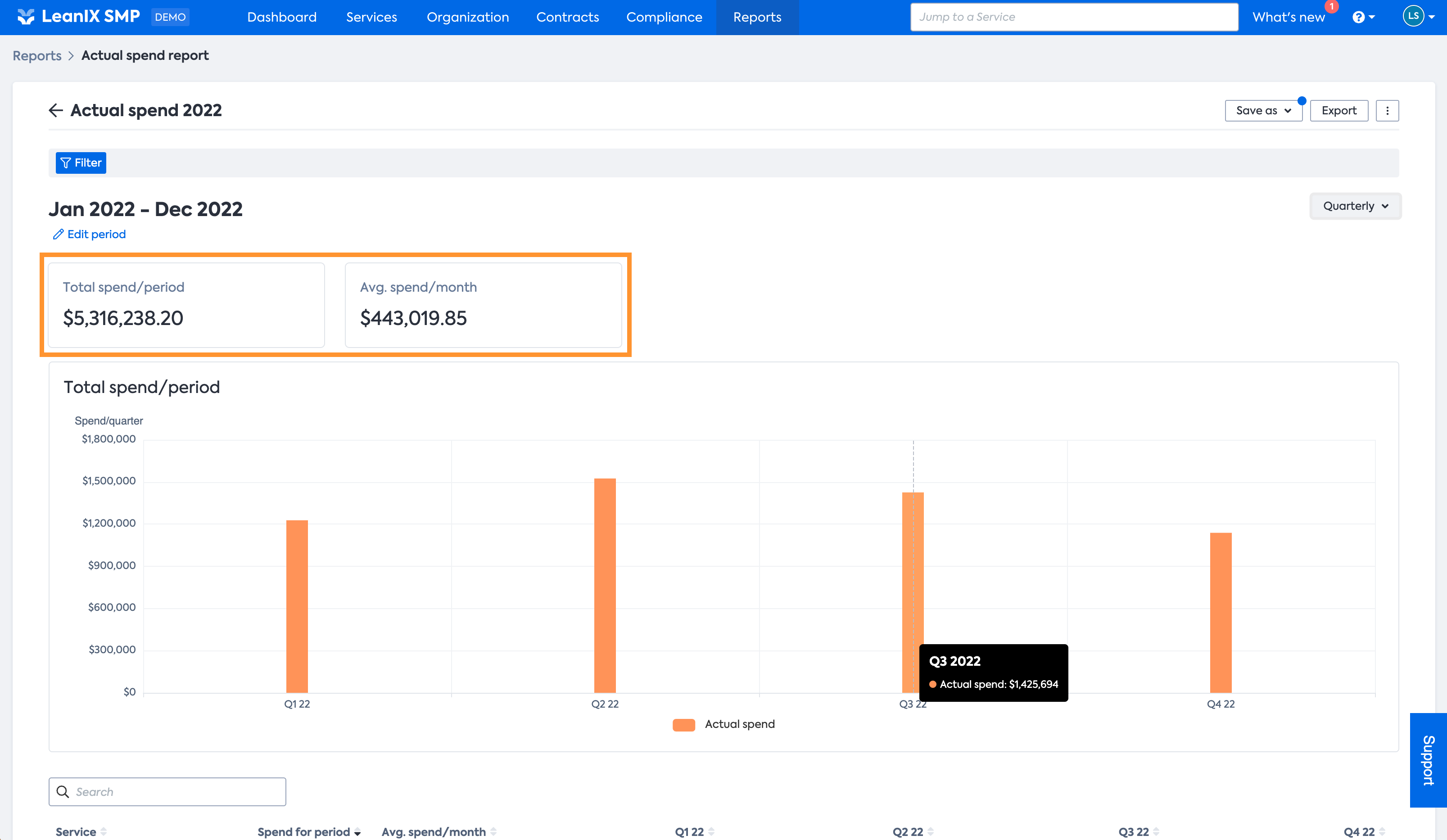
On the top of the report, you will find the summary of the currently in-scope period, stating the total spend in the period, so all SaaS spend detected for the selected period.
Next to it, you can see the average spend per month for the given period.
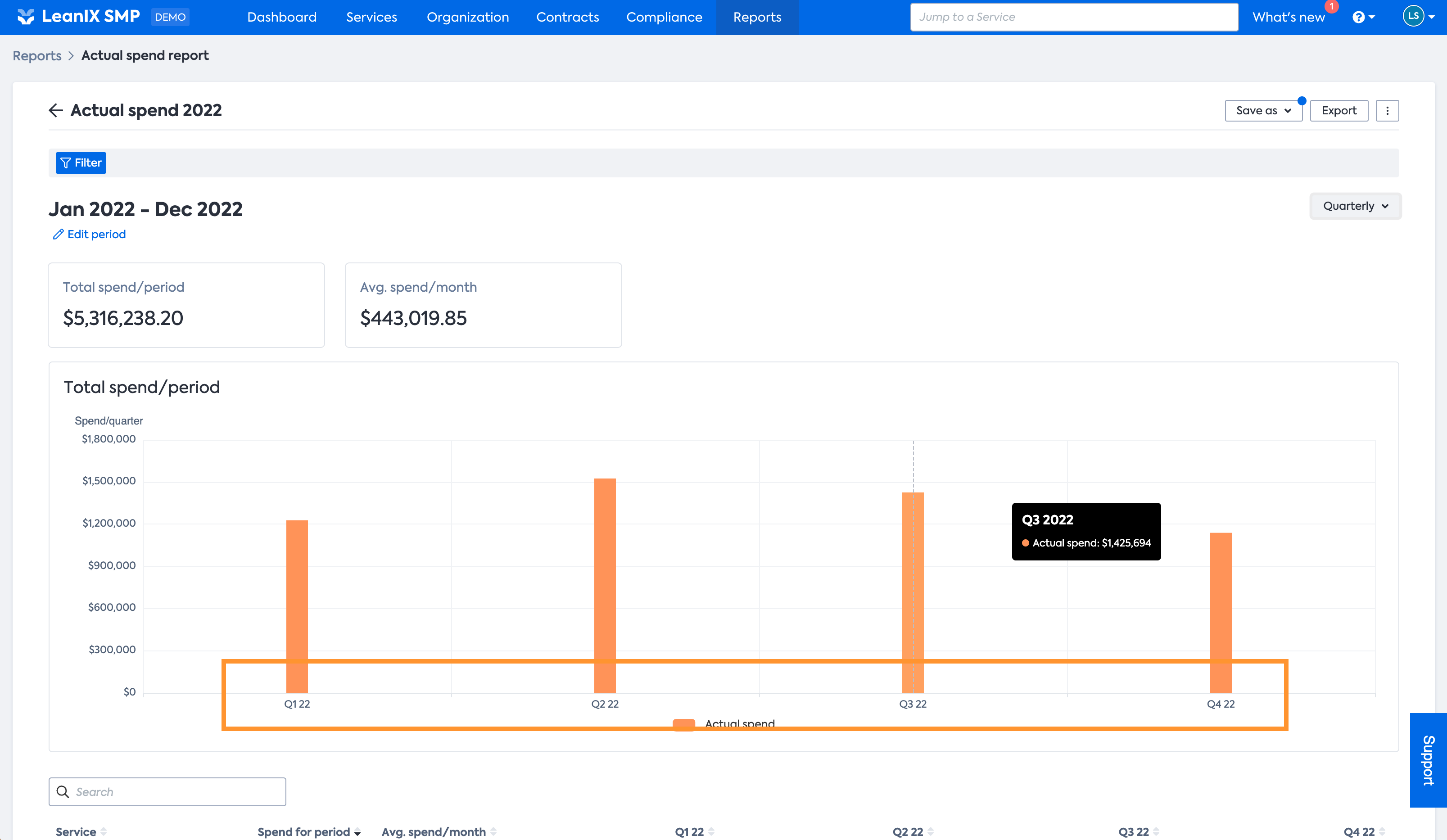
Data visualization
Beneath the KPIs, you can find the graph that visualizes your SaaS spend over the selected time period. The view automatically adjusts to the selected period, the chosen granularity and the SaaS that is scope of the currently applied filter.
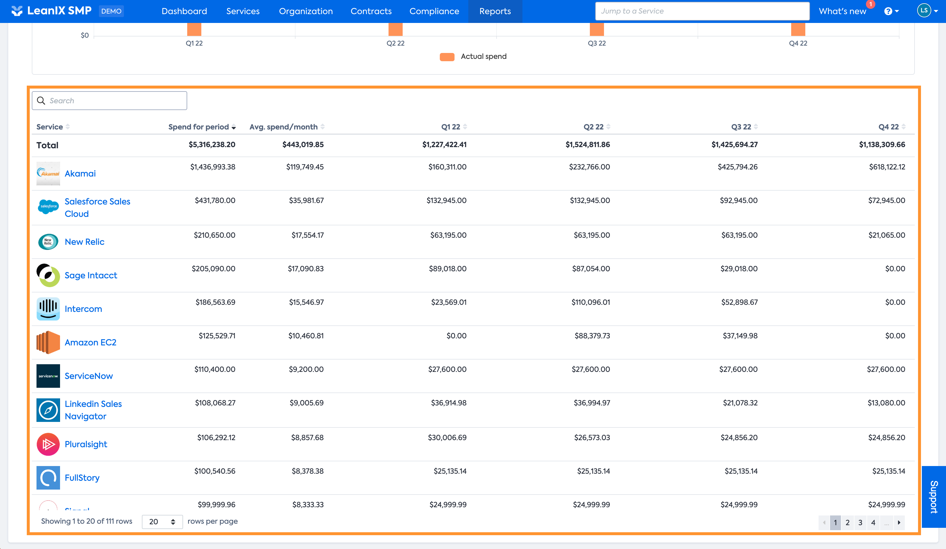
Detail view
The detail view below the data visualization contains all the details that are used to generate the graph above. It lists all services that are in the scope defined by the filter individually, with their spend, either per month, quarter, or year - depending on the selected granularity.
The detail view also shows the total spend per service for the selected period and the average spend per month for the same period.
If you are looking for a specific service, you can of course search in the list.
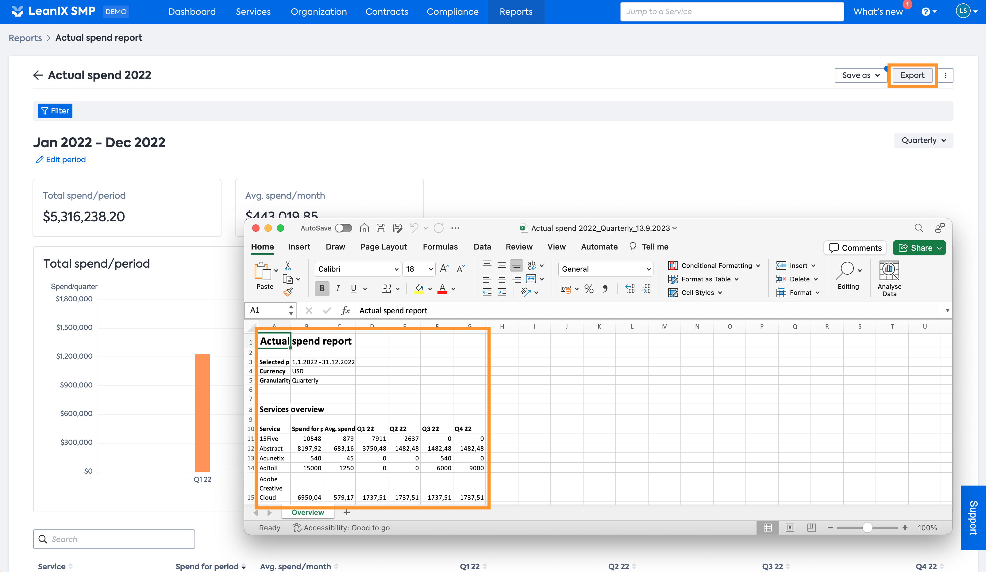
Export
To make sure you can use all the details presented in the report for further analysis the report can be exported.
Selecting the Export functionality on top we will generate an Excel file of the detail view for you to download. The Excel contains all details included in the detail view.
Updated 11 months ago