
User Accounts (Active & Inactive)
User Accounts are available when you open a service from the Services tab. You can find various information on a service related to its users.
Discover Reliable User Accounts
The quality of User Accounts heavily depends on the connected integrations. We encourage you to connect both Discover and Manage Integrations to get the most reliable and up-to-date data.
For each connected integration, single or multiple separate charts are shown. If you have multiple service accounts of a Manage Integration, you can filter which data is displayed using the Service account selector at the top.
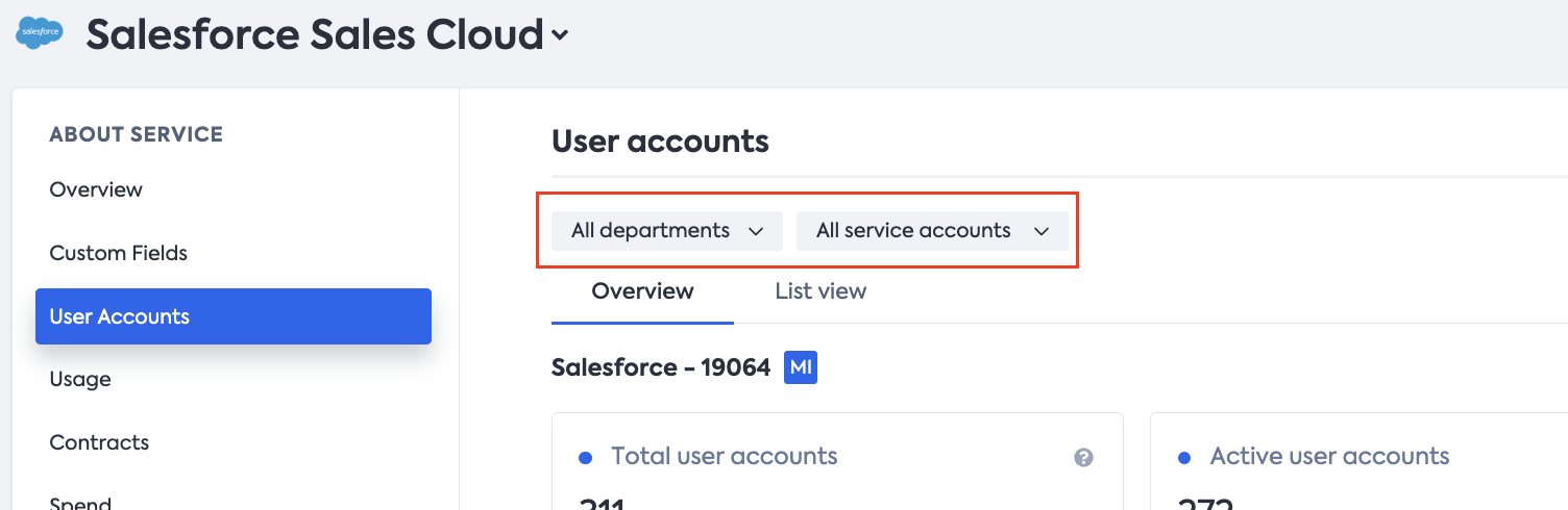
To filter data by departments, use the Department selector next to it.
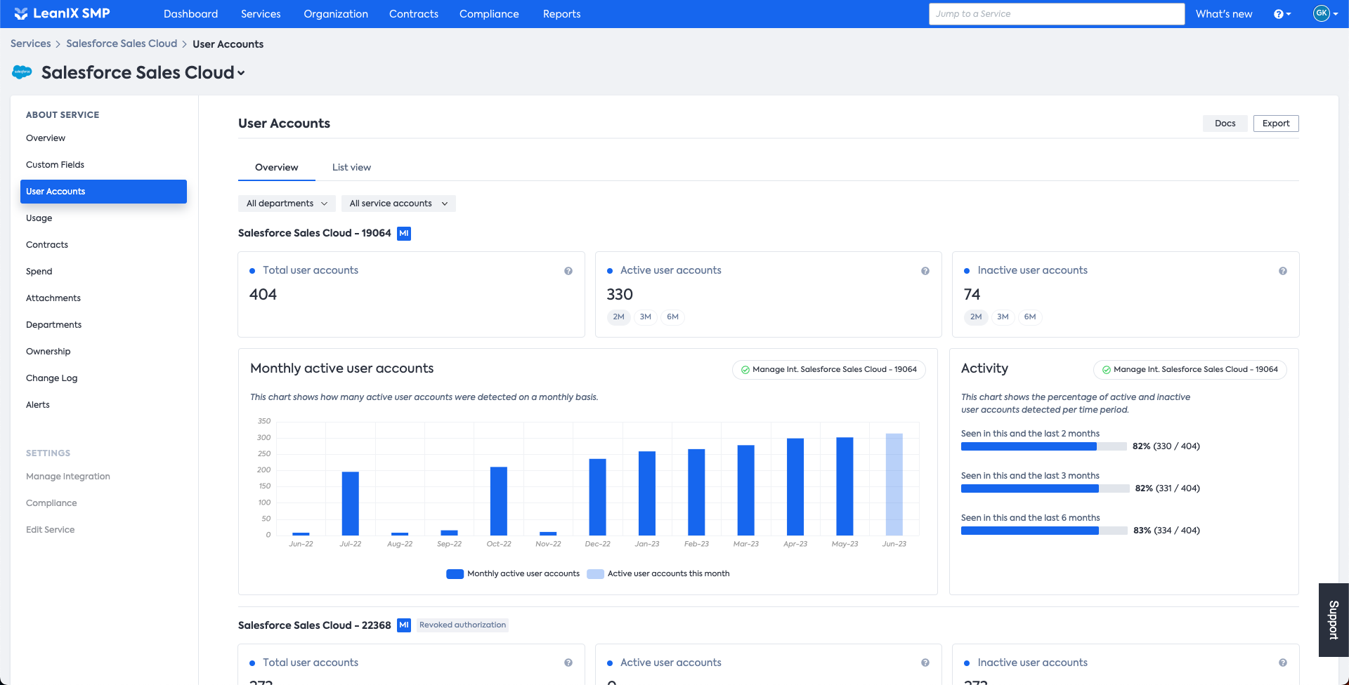
User Accounts: the Overview page
The Overview page offers a graphical presentation of data in the form of charts. Charts are displayed depending on which integration you have connected, as it affects which data we are able to collect.
Overview of User Accounts based on SSO data
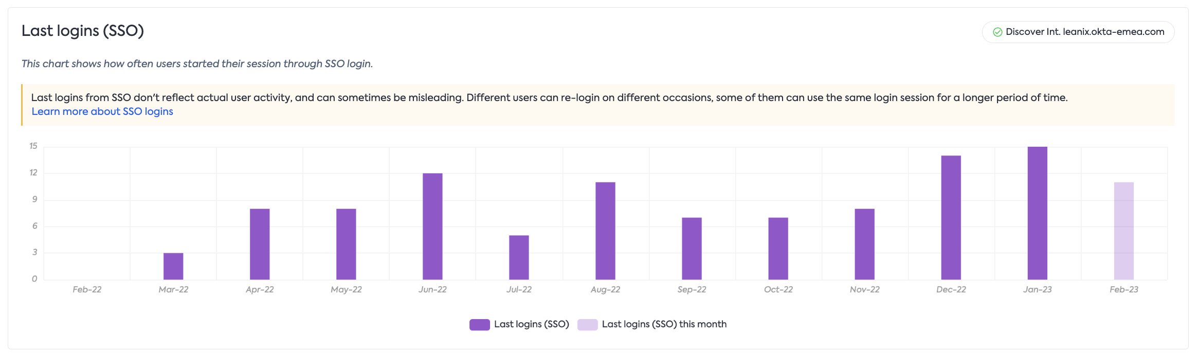
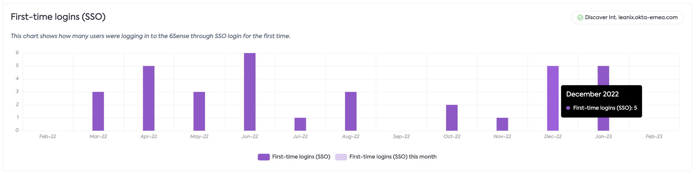
When an SSO Discover Integration is connected without a Manage Integration, two charts will be present on the page:
The Last logins (SSO) chart shows how often users started their session through SSO login. Keep in mind that this information, depending on the SSO setup, may not reflect actual user activity and can sometimes be misleading. We encourage you to connect a Manage Integration for more reliable data.
The First-time logins (SSO) chart tracks users signing into the service via SSO login for the very first time. Each user will only be counted once in this chart.
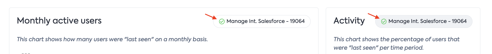
Overview of User Accounts by Manage Integration
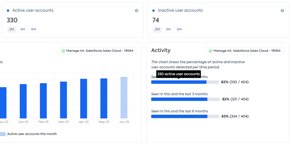
When a Manage Integration is connected and has “last seen” capability (which you can check in the “Manage Integration” service settings tab), a Monthly active users chart replaces the Last logins (SSO) chart for more reliable data. This chart shows the number of users seen on a monthly basis. Coupled with it is the Activity chart that offers information on the number of users active in the last 2, 3, 6 months.
Placed above the charts, there are 3 distinct info cards displaying the following information:
(1) The overall count of detected user accounts.
(2) The total number of user accounts that were active within the last two ("2M"), three ("3M"), or six ("6M") months.
(3) The number of user accounts that were inactive within the same timeframes mentioned above.
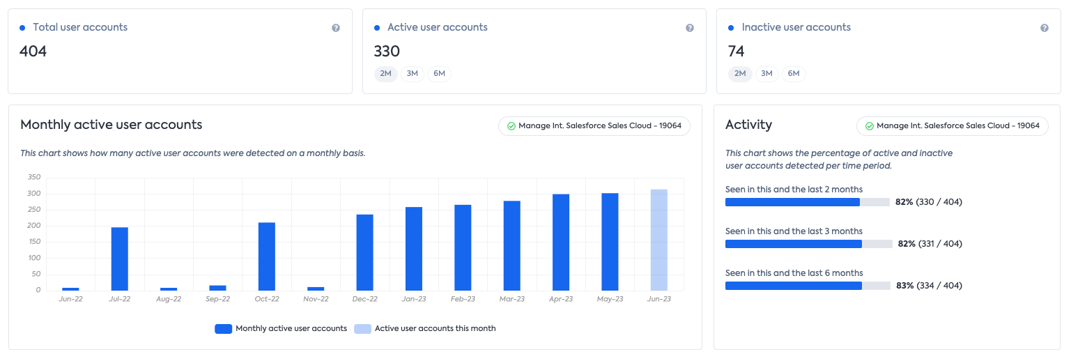
Each chart is equipped with the status of that particular integration. Clicking on it will take you to the corresponding integration page in the administration.
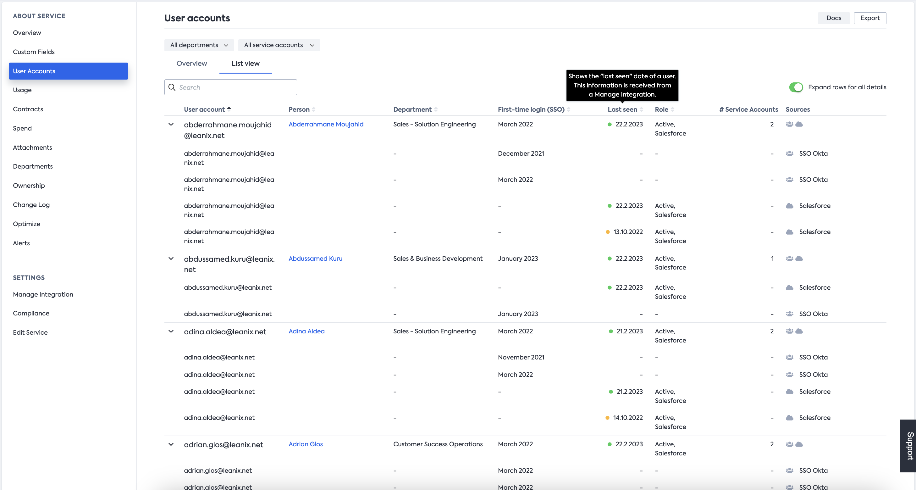
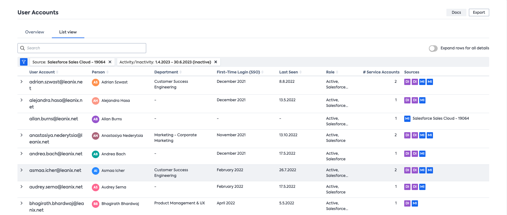
User Accounts: the List view
The list view displays all User accounts detected throughout all integrations in a table. User accounts that are recognized as related are grouped into one “parent” user account. To expand all parent rows, use to toggle on the top right. You can search the table for the user account you’re looking for and sort results by sortable columns.
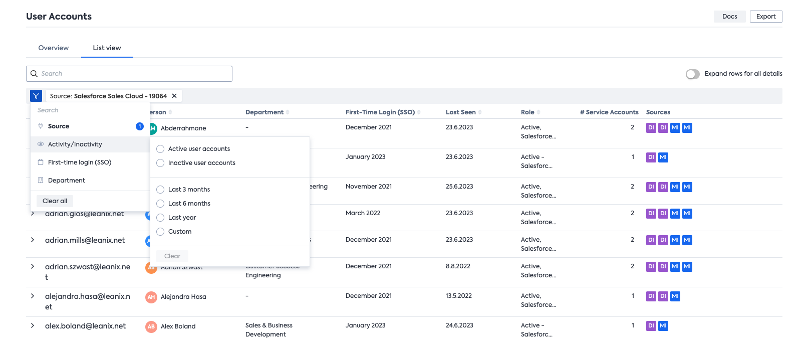
List views for Active & Inactive User Accounts
To check the recent activity status of user accounts within a specific timeframe, you can navigate via the info cards located at the top in the Overview tab. Alternatively, you can click in the Activity chart on the blue bars (representing active user accounts) or grey bars (representing inactive user accounts).
These actions will automatically direct you to the List view, filtered according to the chosen criteria:
You can accomplish the same outcome directly from the List view by selecting the Activity/Inactivity option in the Filter. Additionally in this dropdown, you have the flexibility to enter a more granular time frame using the Custom option.
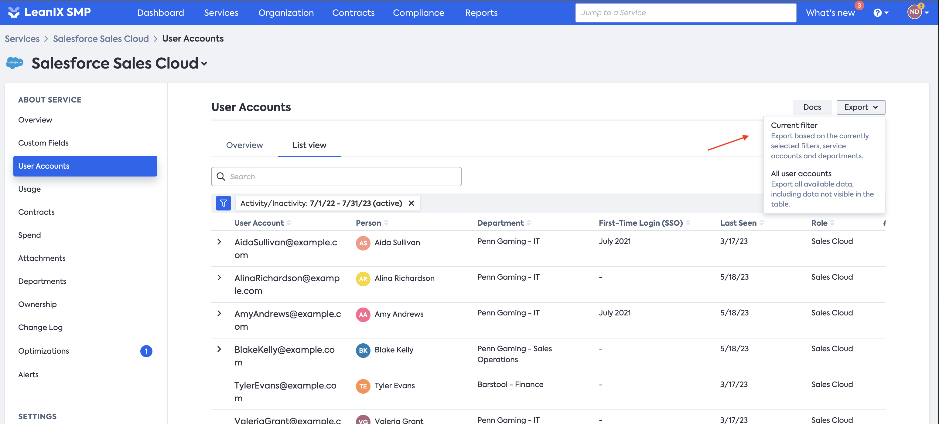
Export User Accounts
User accounts can also be exported into an Excel file. This can be done by clicking on the Export button in the top right, which opens a dropdown menu. From there, you can choose to export all user accounts or to export just the ones that are currently visible based on the applied filters.
Updated about 1 year ago